
Wednesday, May 27, 2009
VANS OFF THE WALL painting
Finally wrapped up the painting to the private book release party at Vans HQ. The book showcase several decades of "athletes" and art under the iconic shoe company and OTW logo. They asked a handful of artists who have been involved in previous Vans art projects to contribute a piece and their intrepetation of the logo and the influence it had on their lives. I chose to represent the first vans shoe I wore when shredding on my bmx, freestyle bike or skating(the blue/yellow checker slip on in front). Since then I have worn numerous slip ons as my daily shoe. I also designed a bunch in the painting that I would like to wear.


Saturday, May 23, 2009
...on my way to finish the VANS painting
VANS has asked their handful of artists and designers that created work for the iconic shoe company over the years to create their own intrepretation of the "off the wall logo" and the influence it has had on their life. These paintings are in tandem with their first book release party early June.
Friday, May 22, 2009
The Process of a Commission
Recently a high school friend contacted me after we hadn't spoke or seen each other in over 13 years. He and his wife were very interested in a painting for their house. Never having commissioned a painting especially for themselves, I thought it would make an engaging post on this process, and as a reference for others in the future.
Their original interest and inspiration for the considered piece was this small digital piece i did back in 2007 for the "taxonomy animalia" show at the limited addiction gallery(now dave b smith gallery).

12" x 6", mixed media(digital piece outputted on watercolor paper w/ varnish finish on board)
What followed was a lengthy approval process that required the finish painted to be done in a way I had never painted before. They wanted a 77" x 33" painted piece but done in the style of the digital painting. It was the background graphics and the transparency effect that they really admired. This posed a major technical challenge when it came time to render the bird which they had expressed to be a phoenix instead. We started with some digital comps and searching for the perfect bird reference.
The background texture:

Several bird/phoenix references they had found and i had found:


We ended up choosing the black version for now and began tweaking the background:

At this point the clients were satisfied how the comp was feeling and i began stretching, building and prepping the painting:

I would occasionally update them with process photos as i went along in the work:

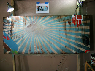
At this point I felt the background was rich and compelling and needed no further work. This was a crucial commitment since the nature of this process allowed no further "back rendering" because of the phoenix transparency effect. Once I began the phoenix there would be no command Z.
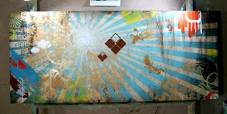
A month had past at this point and i was never thrilled about the original phoenix reference. I found that Osprey's were a solid reference that portrayed a bird with a robust presence and anatomy:
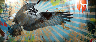
I tried to sketch out my own version of that bird but it never really moved me, instead, I found this dynamic eagle shot, and sketched a phoenix version of this eagle. This was the finally approval, and the clients like me, were now very satisfied with the composition/position of the bird:

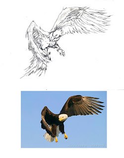
The only last three minor changes that were requested that the talons/legs be more relaxed, that the tail feathers be more narrow and longer, and the the frill on top of the head be moved forward a bit. I then proceeded to render most of this phoenix with a very small #1 round brush and a couple of other old brushes i modified to create intense texture and form.

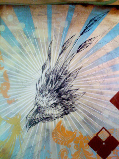

The finished piece, Thanks Scott & Laura for this opportunity and challenging me!!

Their original interest and inspiration for the considered piece was this small digital piece i did back in 2007 for the "taxonomy animalia" show at the limited addiction gallery(now dave b smith gallery).

12" x 6", mixed media(digital piece outputted on watercolor paper w/ varnish finish on board)
What followed was a lengthy approval process that required the finish painted to be done in a way I had never painted before. They wanted a 77" x 33" painted piece but done in the style of the digital painting. It was the background graphics and the transparency effect that they really admired. This posed a major technical challenge when it came time to render the bird which they had expressed to be a phoenix instead. We started with some digital comps and searching for the perfect bird reference.
The background texture:

Several bird/phoenix references they had found and i had found:


We ended up choosing the black version for now and began tweaking the background:

At this point the clients were satisfied how the comp was feeling and i began stretching, building and prepping the painting:

I would occasionally update them with process photos as i went along in the work:


At this point I felt the background was rich and compelling and needed no further work. This was a crucial commitment since the nature of this process allowed no further "back rendering" because of the phoenix transparency effect. Once I began the phoenix there would be no command Z.

A month had past at this point and i was never thrilled about the original phoenix reference. I found that Osprey's were a solid reference that portrayed a bird with a robust presence and anatomy:

I tried to sketch out my own version of that bird but it never really moved me, instead, I found this dynamic eagle shot, and sketched a phoenix version of this eagle. This was the finally approval, and the clients like me, were now very satisfied with the composition/position of the bird:


The only last three minor changes that were requested that the talons/legs be more relaxed, that the tail feathers be more narrow and longer, and the the frill on top of the head be moved forward a bit. I then proceeded to render most of this phoenix with a very small #1 round brush and a couple of other old brushes i modified to create intense texture and form.


The finished piece, Thanks Scott & Laura for this opportunity and challenging me!!

Monday, May 18, 2009
One of many more furniture projects to be finished soon
This 3'x3' coffee table is made from reclaimed oak pieces of a 1950's organ, malaysian kuring wood, and curved 3/4" plywood legs
Subscribe to:
Comments (Atom)


